Project type
Branding
Project Safe Rebrand– UGA Design Center
Project Safe is a non-profit in Athens, GA with a mission to end domestic violence.
LOGO CONCEPT
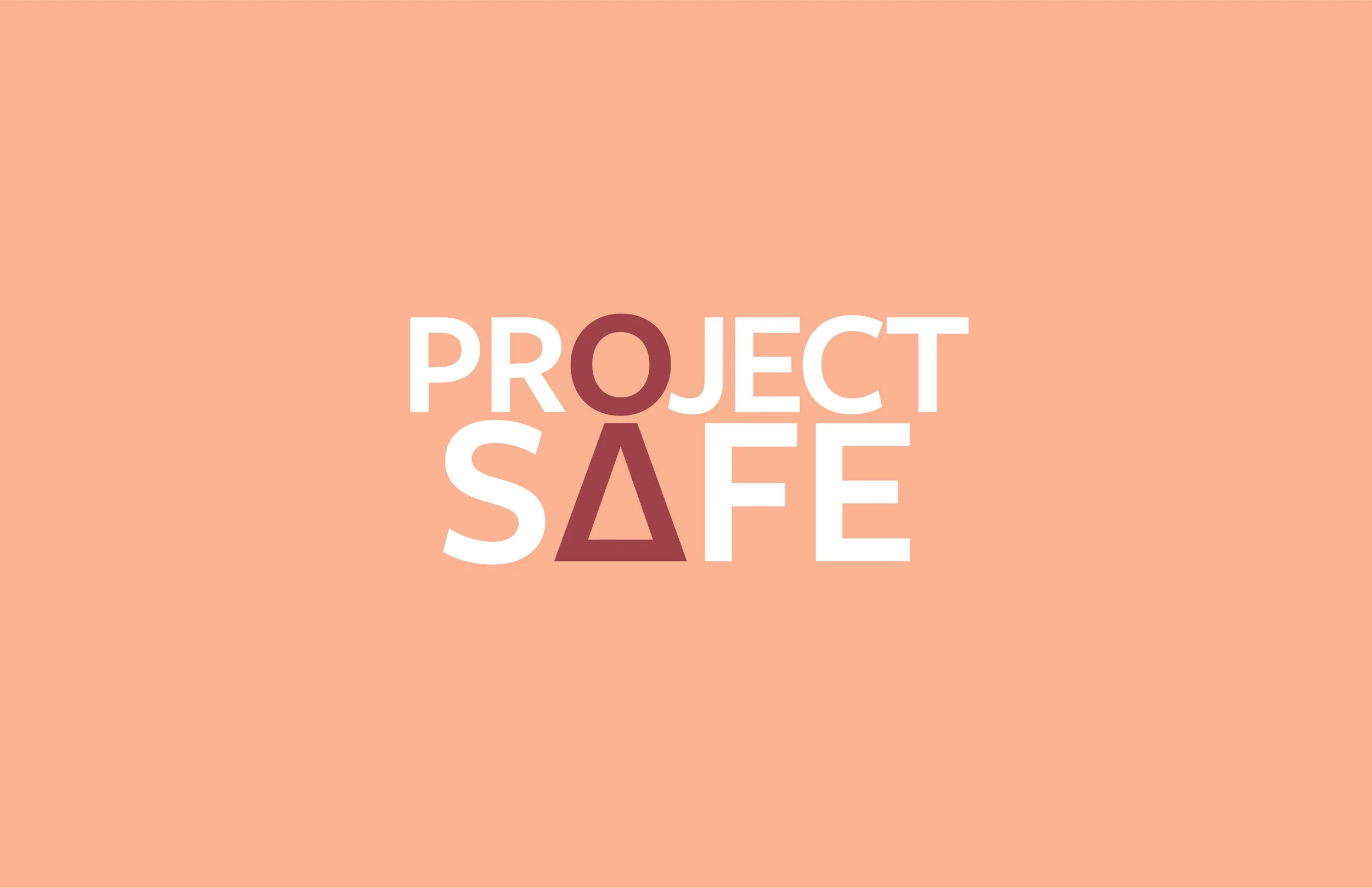
I wanted to make the logo all about the woman.
The woman is what Project Safe does this for– she should be highlighted and put front and center. The logo also reflects a key hole, which I wanted to depict as a woman’s freedom from domestic violence being unlocked.
COLOR SCHEME
The national color of domestic violence awareness is a bright purple, and this purple is used currently as Project Safe’s color, but I wanted to pull PS away a little bit to give their own look and identity that people could adopt and recognize as that of Project Safe’s. I included a shade of purple as part of the scheme.
ICON SYSTEM
The original icon of the woman was born from the letterforms of the typeface used in the logo type. Her head is the O, and the body is the A with the crossbar dropped to the floor to create the dress. I pushed these icons to create a man from the letterform E, then an arrow, then flipped the woman on her head to create an exclamation point for awareness pieces.
ONE IN THREE.
I adopted the phrase “one in three” to highlight how one in three women are affected by some form of domestic violence.
Project Safe Thrift Shop
Additionally, I decided to create collateral for the thrift shop in town. I broke apart the icon system and created a playful pattern.


